If you’re in any business that uses colour – home or fashion design, paint or dĂ©cor – you already know that the Pantone Colour of the Year for 2014 is (drum-roll please), Radiant Orchid. If you don’t think this impacts your life, you may be surprised by how much colour actually creeps into your world, from the lilac-tinted bouquet of flowers you send to a loved one, to the slightly subdued hot pink lipstick you just picked up at the drugstore.
Known as the global colour authority for design industries, the Pantone Color Institute offers future colour direction and studies how colour influences human thought, emotion and physical reactions. In other words, it’s no accident that the feature wall in the show home is Radiant Orchid, or past colours of the year like Emerald or Tangerine Tango. This year’s choice is described as a captivating, magical, enigmatic purple, sure to stir something in a home, or flower, or lipstick-buyer’s soul.
“While the 2013 colour of emerald served as a symbol of growth, renewal and prosperity, Radiant Orchid is an enchanting harmony of fuchsia, purple and pink undertones, inspiring confidence and great joy, love and health,” said Leatrice Eiseman, executive director of the Pantone Color Institute. “It is a captivating purple, one that draws you in with its beguiling charm.”
In the home, the eye-catching hue will be front-and-centre in paint, accent pieces and accessories, complementing olive, deep green, teal and even light yellows. Trevor Compton, sales manager of Christopher Clayton Furniture and Design, said the rich shades of purple are already in high demand in bedroom décor, livening up neutral greys, beiges and taupes.
“It’s uplifting and bold, without being overpowering, and when used with grey, it can create a restful oasis,” said Compton. “In bedding, or as a wall colour, this purple adds a touch of luxury and makes a romantic, beautiful statement.”
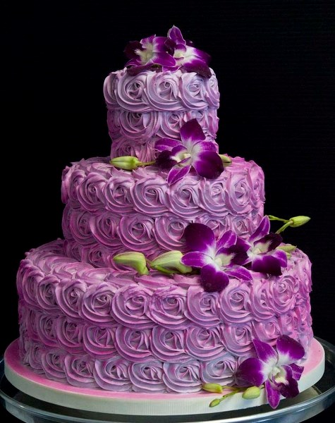
When you’re the “it” colour, you find your way onto trendy fashion accessories (belts, scarves, purses) and on table linens – even wedding cakes. Custom cake creations at St. Albert’s Over the Top Cakes feature purple in a big way, from lilac-hued ribbons to purple tinted flowers, elegantly matched with silvers and greys.
“We’re doing tons of cakes in purples – often matching the bridal florals – in shades like eggplant and matching rich jewel-toned purples, teals and greys,” said store co-owner Deb Lasuik.
If, as Pantone describes, Radiant Orchid is an invitation to innovation, encouraging expanded creativity and originality, then local designer Cory Christopher must have been given a heaping helping of it. Now full swing into wedding planning season, Christopher’s space in downtown Edmonton has hits of purple scattered about – atop wedding cakes, on ribbons wrapped around chairs and all-over tablescapes – floral centrepieces, napkins, runners and the like.
“I’m all about inspiring people to find what’s special to them, and then building on that,” said Christopher. “I ask people, 'Why do you love this purple?,' and work with how it speaks to them.”
For the glitz of a formal table, Christopher said this year’s purple tones work especially well with silver, glass and crystal, to create a sophisticated tablescape.
If you’re inspired to run out for a gallon of paint right now, it’s Radiant Orchid, Pantone 18-3224. Congratulations, you are now on trend.